As always, my web design post involves tech, design, and analytics. I realize this is probably of little interest to many people here, but it’s a post I enjoy writing each time I redesign my site.
Frequent visitors know that I tweak and fine tune things here almost weekly, but only after many iterations does it become, in my mind, an official redesign.
For reference, I am on WordPress and I use the Focus theme from Chris at DIYThemes. This is not an affiliate post or an ad, I’m just a fan of software that gets out of my way and lets me do my work. I’ve been using his software to build my websites since 2009.
Since 2013 I’ve been using the Gotham font from Hoefler&Co on my site. It’s the same font I’ve used for my logo since 2007. You may also see a few of their other fonts used on images.
The only plug-in I use is Gravity Forms.
This latest design is all about life evolving.
Sounds a bit dramatic, but like so many, my business has changed a lot in the last 12 months. This time last year I had hundreds of day tours of Rome scheduled. I had 15 group pilgrimages I was scheduled to lead to Italy, France, Ireland, Portugal, the Holy Land, Jordan, Germany, Austria, and Spain. It was to be my busiest and most organized year since I started The Catholic Traveler in 2004.
Obviously things didn’t work out as planned and my tours and pilgrimages will have to wait for the world to reopen.
Coronavirus Reporting
As Italy took the first big hit with the virus after China, I immediately started making daily videos of what was going on here in Rome. These daily updates were to offer on-the-ground reporting so that friends and family back home in the US could see what might soon be there.
I wanted a page for all my reports to be organized in reverse chronological order, but I also wanted more control than a typical blog layout. Some reports would have info about things that changed that day, some would be full posts with articles I wrote or one of my videos, some would be links to interviews I did, and sometimes I had several updates each day. So I built a page to manually enter each post. For a few months, this page basically replaced the homepage.
Lots of video content can slow down a site, and with a daily video update, I was grateful for the YouTube Box that works with Focus. You can see it in action here. Notice how the page loads super quick, a video preview is here, but it’s not embedded in the same way as a typical YouTube video.
The People Want More Video
As Italy recovered and America was getting worse, people realized it would be awhile before they could travel.
I stopped with the Coronavirus updates over the summer as things were getting back to normal here. But I started exploring the city more and more. Each day I would share my walks around Rome. People loved these.
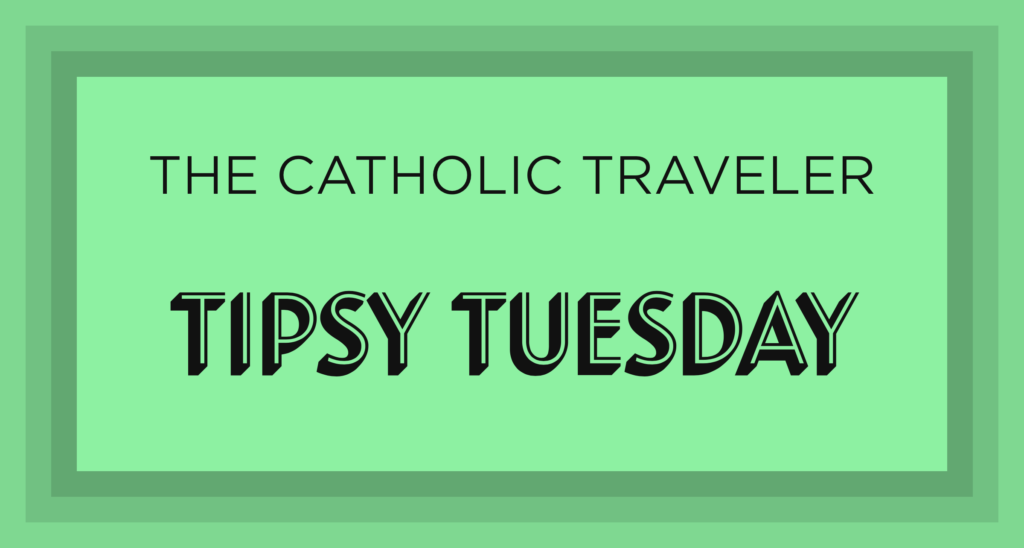
As much I as enjoyed sharing Rome, I really missed connecting with people. Remember, I would have hundreds of tours a year in normal times, now it was just me alone walking empty streets. So I got a bit down. It was during this period that I decided to take my people to a bar for a drink, and Tipsy Tuesday was born. As of this writing, I’ve done over 20 weekly live events from bars around the city.
After a few months, I added another weekly live event, Second Cup Saturday, which is the same concept, but with coffee instead of cocktails.
Each live event is streamed on Instagram and/or Facebook and YouTube. The videos are then posted on my site. You can see an example here.
A Podcast
I’ve been working on a podcast for four years. Well, I’ve been thinking about working on a podcast for four years. And a few months ago, we launched. The podcast focuses on Catholic travel, of course, so I wanted each episode to have its own page that contained photos and more info related to that show. Here is an example of one of the episodes. I was also able to design the player to fit with the rest of the site. Big, bold, and orange.
Back to the Blog
Right or wrong, people love to hate on social media. Anytime there is an update to terms, people threaten to leave. Anytime someone they like gets banned, people threaten to leave. People fear being controlled by the algorithm, and threaten to leave. I get that, but our society is attached to social media and that’s where we consume. That said, I want to own my content, and so I’ve been focusing on bring all my content back to my blog.
Over the years, I’ve neglected the blog. I post occasionally, but I post on Instagram daily. While I don’t want to make every random Insta Story a blog post, I do want my best content on my own website. I am not leaving social media, just bringing more of my content here.
Of course the reach on social is easiest, but my site is searchable and I can control what you see and how you see it, rather relying on some algorithm.
I don’t want a typical blog with post after post or snippet after snippet. I’ve been using the list of headlines style for a long time. I want you to see the links I think are important, relatable, and relevant.
I tweaked the blog page to first display the five most recent headlines with a post date.
Then I have my top seven articles, then the podcast, Tipsy Tuesday, etc. So basically the blog page is broken into categories with the ability for the viewer to dig deeper, but with me controlling what is displayed on the main page.
For those who are thorough and want to see it all, the archive page for each category is linked as well. On the page for all Articles, for example, you’ll see the headline, dates under the headline, and plenty of white space. Simple, easy to read, and easy to scan.
For years, I didn’t display post dates, because I focused on evergreen content. But now I am trying to post daily and want people to know what they are seeing is current. I’ve also started including tags at the bottom of posts. I always felt tags were added noise, but I think they can be helpful if used properly.
Traditional Navigation vs Breadcrumbs
I ditched the standard navigation bar over a year ago. I have a traditional navigation bar on the homepage, but then use breadcrumb navigation on every other page. Some people use both a traditional navigation menu and breadcrumbs, but that’s way too many options for the average visitor. As you can see from the image below, people who land on my page looking for Papal Events in December, will see more relatable nav options for someone traveling to Rome.

Breadcrumb navigation
Social Media Images
You know the image that shows up when you share a webpage on social media? You can actually control what is displayed with the Open Graph Box. So rather than Facebook or Twitter picking the first image in a post, I can create a custom image with the correct dimensions to display across all socials. Even better, that image doesn’t have to appear on the page itself, so I can have something like the image below for a Tipsy Tuesday episode about green sambuca.
Custom social media image
Modular Content
If you clicked around, you probably noticed at the top of each page is a colored box, like the image below.
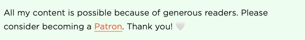
Modular content example
These display different content depending on which page you visit. All basically say something similar, that the content/video/article is made possible by my patrons. Some mention something related to the post, like an alert saying a museums is temporarily closed, for example.
You also may notice a similar box at the end of some posts, those might say something like “subscribe to the podcast.”
A great thing about these boxes is that it’s not something I have to write on each page, I can write it once and every post in that category is updated immediately.
Ads and Pop-ups
I have never had an ad on my website and never used any sort of pop-up. I realize some people need ads to pay the bills, but unless that site is getting hundred of thousands of visitors a day, how much are they really making? And at what expense?
Too often I see a post with so many ads I can’t tell what is content and what is an ad. It’s awful. Does anyone enjoy this?
Some tech bloggers use a single ad for a week. It’s small, designed to fit into the site, and it’s relatable to the audience. More should take this approach. Today I visited a popular Catholic blogger and got an ad in the middle of the article for “17 Photos of Kate Moss Drinking” and “22 Random Watermelon Inspired Things.” The article was about online courses for Catholics. I visited the site of a travel blogger and right in the middle of the post was an ad for industrial air conditioning units. In neither case did these advertisers reach, even remotely, their target audience, and in both cases it was so distracting, that it ruined my experience.
And email pop-ups are just annoying. I’ve built up an email list of nearly 80,000 people by simply having a box at the end of each post. Maybe that number would be higher with pop-ups, but I’d rather not slow down the site and annoy my visitors.
Homepage
I’ve used a very minimal and simple homepage for years. To be honest, it started because I couldn’t figure out what content to fit into those templates everyone uses that has the big hero image with text over it, followed by some text on a colored background, then another big image, then more text… It always felt I was trying to make my content fit someone else’s design, not the other way around.
But don’t let the simple design fool you, a lot of through went into how it’s displayed. And rarely does a day go by that I don’t receive an email from someone thanking me for the fast and easy to navigate website.
Think about that, people actually take time to write a quick email just to thank me for having an easy to use website.
This is why I am constantly making improvements to the site, to take care of my visitors. 🤍